Why Flexbox?
As a new web developer, it’s difficult to filter through the many ways of webpage organization as your pages get more complex. It’s easy to get started with CSS when you begin applying style properties to elements on your page, but as page layout becomes more complex and users are viewing your page on many different screens, things can quickly become a mess! After talking to a friend working in the industry, I learned that a tool that many developers use is Flexbox, or the “flexible box method”. This article explores the importance of Flexbox, and how to get up and running with Flexbox in your project (it’s that easy!).
According to many, Flexbox is one of the greatest developments in web design and development. Most developers are now using Flexbox to some extent within their projects, and after reading through this article, you will see why! But first, let’s dive a little into the history of page layout and design so we can better understand why Flexbox is so important.
When webpage design was in its infancy (not too long ago!), web developers often coded their entire web pages in HTML, including all design and formatting. A developer would code his or her content within a HTML table that would span the page. This looked decent at first glance, but required a massive amount of recoding whenever any changes were necessary.
Float was soon created which helped mitigate some of those difficulties. Float was initially used for image wrapping until further benefits were realized. Using Float was a much improved alternative to the grid layout. Developers could create and edit a webpage without having to rewrite the entire code! Float wasn’t perfect, but it was MUCH better than the alternative of the HTML table.

Next comes the invention of Flexbox! Flexbox was designed as a much more user friendly way to manipulate a one-dimensional layout model and to arrange items within a container, or “flexbox”. We are able to achieve complex layouts with only a few declarations (centering items, automatic spacing, inline element manipulation). Let’s learn a bit more about the practical applications of this.
Flex Container

When using flex, you will need a parent container div where you will wrap all the children elements. The parent div is outlined in red above, and an example in code can be seen below.
We can add Flexbox properties to this parent div within css by adding display:flex;. This is all it takes to initialize Flexbox.
Using repl.it, I have added some borders to the divs so that we can see the following result:
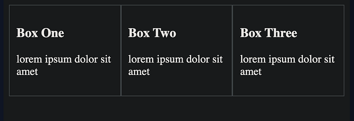
We can see that the div box items have become ‘flexible items’ and now span across the page, as opposed to vertically listed items. This is the first step to making our page “flexible”! Now that our items are flexible, we have many options! I will walk you through three of the most applicable properties: justify-content, align-items, and wrapping . I recommend gamification sites such as Flexbox Froggy if you’d like to learn more!
Justify-Content
Now that the divs snap across the screen on this horizontal access, we can play around with them some more. The following are some commands to add within the css div box to add additional functionality:
flex-start • flex-end • center • space-between • space-around • space-evenly
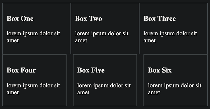
See any of the resources below if you’d like a listing of all the justify-content properties. Below, we are using justify-content:space-between with the second container (boxes 4–6). We also add a flex-basis:27% to the individual boxes to shrink them so we can see the spacing. No other css necessary!
Wrapping
There are two parts to wrapping that I will discuss: a layout change so that the data becomes columns when the screen becomes smaller, and applying wrapping to the flexboxes so that only a certain amount of boxes fit on the screen at a time.
When we wrap our div containers with a simple @media(min-width:468px), with the minimum pixels specified, the Flexbox will become a scrolling list when the page width is below a certain number of pixels (sort of like the default view before flexbox was applied). This is great for automatically optimizing for smaller screens!
The other part of this is true wrapping, to only allow a certain number of flexboxes on screen at the same time (depending on screen size). All we have to do here is add flex-wrap:wrap to the parent div, and then determine the flex-basis (width of the boxes) we want. As the screen changes size, items will wrap.
Conclusion
There are plenty more features to familiarize yourself with, so I recommend looking at some of the attached resources below!
I hope this article gave you a taste for the potential of using Flexbox within your next application. As you can see, it doesn’t take much to get up and running with Flexbox. Create a parent div, call on Flexbox, and you’re off!
order • flex-grow • flex-direction • flex-grow • flex-shrink • flex-basis • align-content • align-items • align-self
